Corporate website
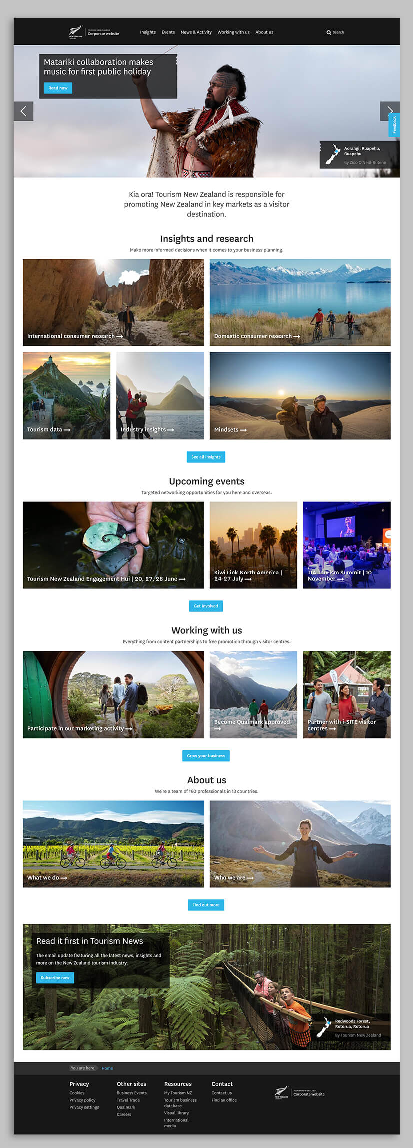
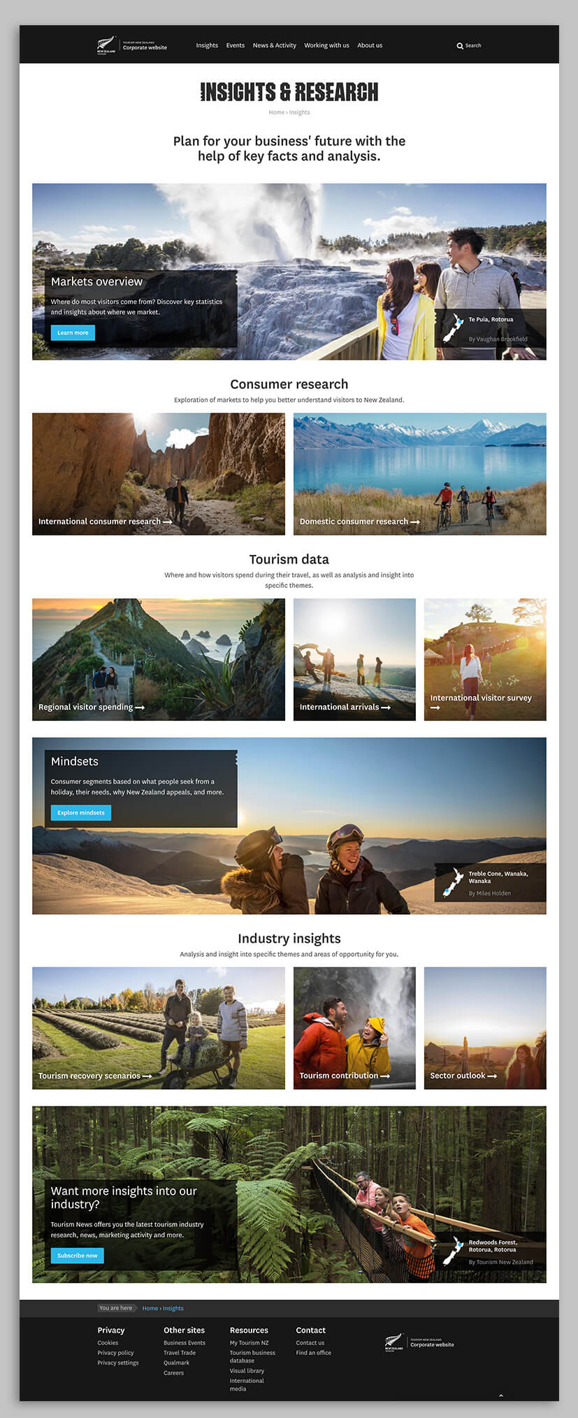
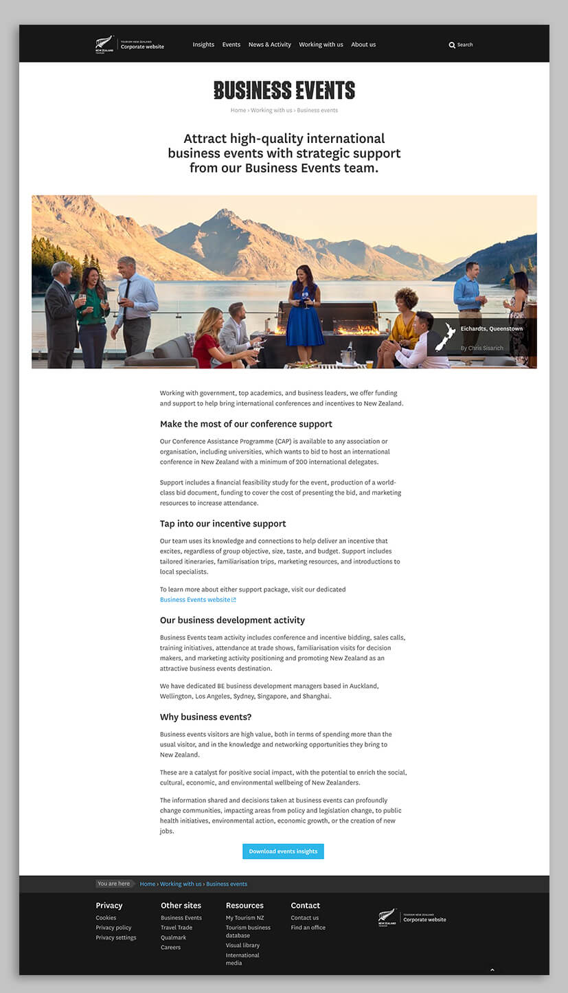
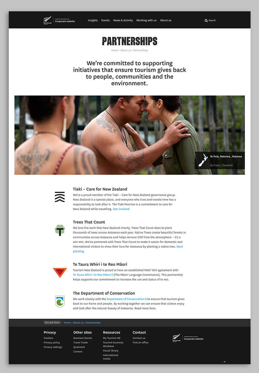
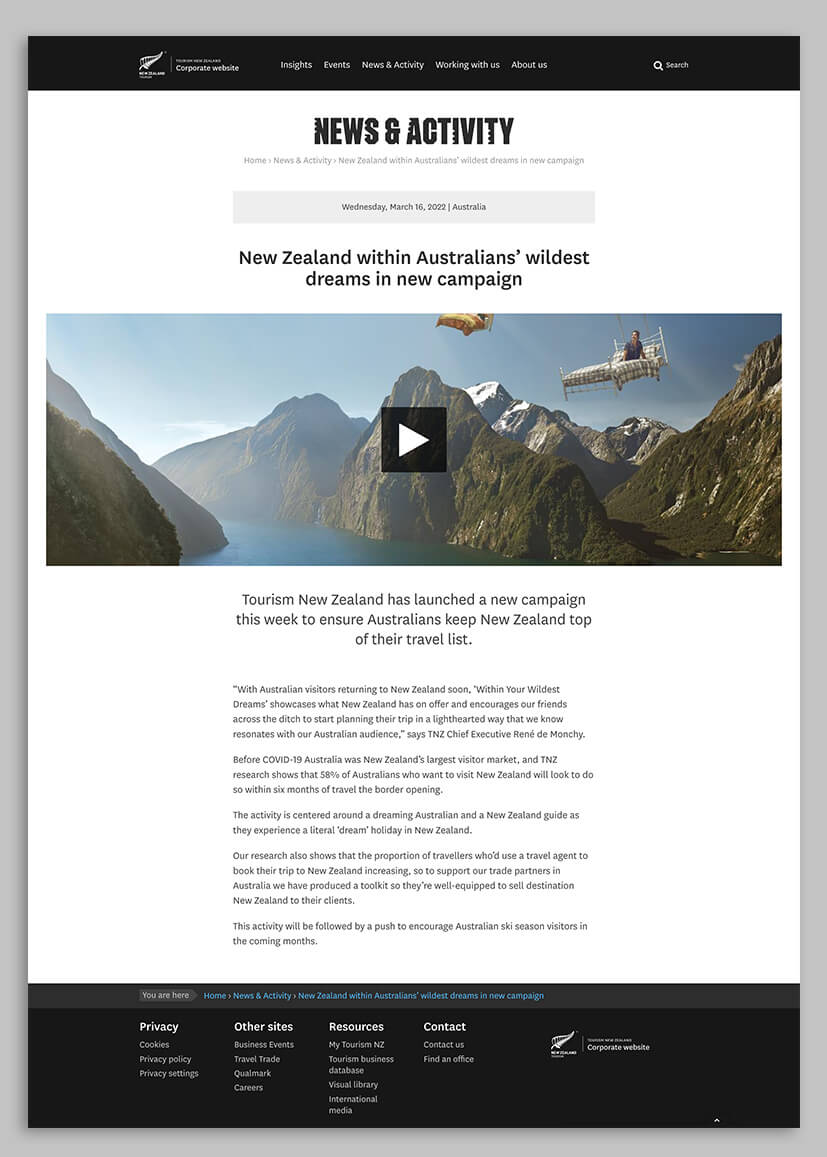
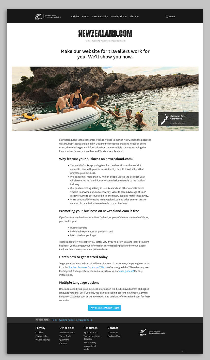
As a writer my words are largely at the mercy of others including marketers, designers and content loaders. I’m never quite sure how things will actually turn out until sites go live. So when Tourism New Zealand offered me the chance to not only edit but rebuild their corporate website on a new platform (which I had never used) I naturally said yes. The sitemap and wireframes were indicative when I arrived (maybe 80% done). But there were still issues for me to guide stakeholders through, like what should go where, the pros and cons of mega menus, and next steps in user journeys. Sometimes, websites can be over UX-ed to the point where users have to click far more than necessary to find what they want, and that was the danger here. Luckily, we were all on the same page when it came to the aggressive edit of content that had become very bloated. Tourism New Zealand now has a modern site that feels less ministerial and more on the side of players in the travel industry. Less about who they are and more about what they can do to help.

